The Art of the Corridor
A Complete Guide to Choosing Wall Art for Your Apartment Hallway
The corridor is the first and last impression your home makes. It is the passageway between the outside world and the private space you have created. Yet, of all the rooms in an apartment, the hallway is the most frequently overlooked when it comes to interior design. Many residents rush past it without a second thought, and in doing so, miss a remarkable opportunity to set the tone for everything that follows.
At il-bordura, we receive more requests about corridor art than almost any other space. And it makes complete sense. A well-chosen piece of wall art in a corridor does not just fill empty space, it creates narrative, establishes mood, and transforms a functional thoroughfare into a gallery-worthy experience.
This guide will walk you through everything you need to know: how to size your art, whether to frame it or go canvas, which frame colours suit which décors, and how to choose a photographic tone that speaks to your space.
Understanding the Corridor as a Space
Corridors are unique in interior design terms. They are transitional spaces — narrow, often elongated, with limited natural light and a single viewing angle. Unlike a living room where a visitor sits and contemplates art from a comfortable distance, corridor art is experienced on the move. The viewer passes by, catches a glimpse, pauses if something arrests their attention, and moves on.
This transient quality is actually a gift to the interior designer. It means that art in a corridor can be bolder, more atmospheric, and more evocative than you might dare to place in a room where it would be scrutinised at length. A moody blue-hour seascape, a striking architectural study in black and white, a deeply textured stone façade — all of these work beautifully in a corridor precisely because they are absorbed in passing, making an impression that lingers in the mind.
The key principles to keep in mind when approaching a corridor are: proportion, rhythm, and atmosphere. Get these three right, and your hallway will become one of the most compelling spaces in your home.
Getting the Size Right
Sizing is perhaps the single most important decision you will make when choosing corridor art, and it is the area where most people go wrong. The temptation is to play it safe with smaller pieces — but in a narrow corridor, a small print can look timid and lost, failing to command the space it occupies.
Here are the sizing principles that work best in apartment corridors:
- Wall height is your starting point. For a standard 2.4m ceiling, aim for artwork that occupies between 55% and 70% of the wall height. This typically means pieces in the 80cm–120cm height range for a single statement work.
- Mind the width. In narrow corridors of 90cm–120cm, a single wide panoramic piece (landscape orientation) can make the space feel even more compressed. Portrait-oriented or square artworks tend to breathe more naturally in tight hallways.
- The 57-inch rule. The standard gallery hanging height is to position the centre of the artwork at approximately 145cm (57 inches) from the floor — roughly eye level for an average adult. This rule holds beautifully in corridors.
- For a series of works, maintain consistent spacing. A gap of 5cm–8cm between pieces creates visual rhythm without making the arrangement feel cluttered.
- In very long corridors, consider spacing two or three large works at intervals rather than a single piece. This creates a gallery-walk feel, drawing the eye along the corridor and encouraging movement.
When in doubt, cut paper to the dimensions of the artwork you are considering and tape it to the wall. Live with it for a day. This simple exercise will tell you more than any measurement.
Framed vs Canvas: Which Is Right for Your Corridor?
Once you have settled on size, the next decision is whether to present your artwork framed or as a canvas print. Both have their place in a corridor, and the right choice depends on your décor style, the artwork itself, and the atmosphere you wish to create.
Framed Prints
A frame adds formality and refinement. It signals that the artwork has been curated, considered, and elevated above the purely decorative. In a corridor with period features — decorative cornicing, limestone walls, timber doors — a well-chosen frame anchors the piece in the architectural language of the space.
Framed prints also offer tremendous flexibility. The same photographic print can read as contemporary or classic, minimal or ornate, depending entirely on the frame chosen. This makes framing one of the most powerful tools in your design arsenal.
A canvas print brings warmth, texture, and a painterly quality to a photograph. The absence of glass eliminates reflections — a significant practical advantage in a corridor where light sources may be positioned awkwardly. Canvas also tends to read as more casual and contemporary, making it an excellent choice for modern apartments with clean lines, smooth plaster walls, and minimal ornamentation.
Canvas works particularly well with landscape and nature photography, where the textured surface echoes the organic qualities of the subject. For architectural black-and-white studies, however, the precision of a framed print on fine art paper often tells a more powerful story.
Frame Colours and Finishes: A Practical Guide
The frame colour you choose will either amplify or undermine the artwork it holds. Here is how to match frame colour to your corridor décor:
Slim Black Frames
The most versatile choice in contemporary interiors. A slim black frame creates a clean border that focuses the eye on the image without competing with it. Black frames work across virtually all colour palettes and are particularly striking with black-and-white photography. In a corridor with white or light grey walls, a gallery wall of slim black-framed prints creates an effect that is effortlessly sophisticated.
From the il-bordura collection, consider: Mgarr Malta Church Arch or Rabat Malta Vjal Santu Wistin — both striking black-and-white architectural studies that paired with slim black frames would create a powerful gallery corridor.
Natural Wood and Warm Oak Frames
Warm wood tones bring organic warmth to a corridor and pair beautifully with colour photography — especially Mediterranean landscapes, coastal scenes, and warm-toned heritage images. A natural oak frame around a warm-toned photograph creates a layered, cohesive look that feels both grounded and inviting.
From the il-bordura collection, the Gozo Xewkija Il-Mithna tat-Tmien Kantunieri — a beautifully composed study of the iconic Gozo windmill — would be magnificent in a warm oak frame, especially in a corridor with terracotta or warm white walls.
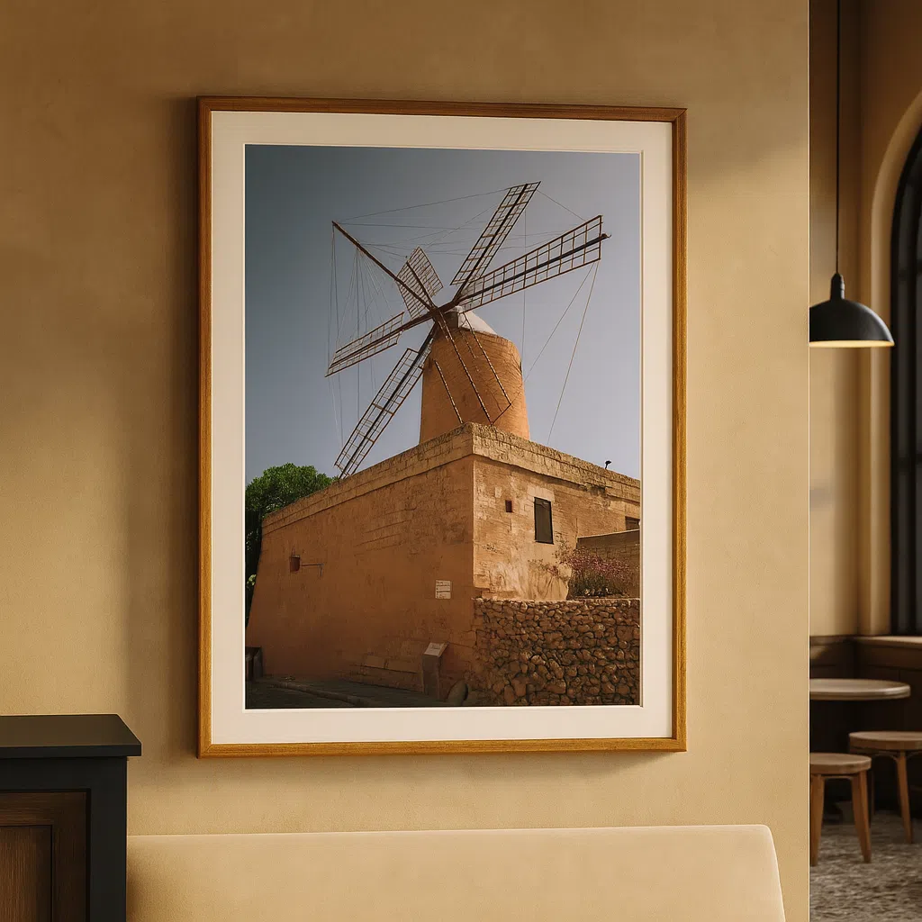
Gozo Xewkija Il-Mitħna tat-Tmien Kantunieri – Wall Art
Transport yourself to the charming island of Gozo with this exquisite wall art piece, capturing the iconic Xewkija Windmill, also
Gozo Windmill Heritage – Malta Wall Art
Gozo Windmill Heritage A Timeless Portrait of Maltese Heritage Captured by photographer Anton Farrugia, Gozo Windmill Heritage is a celebration
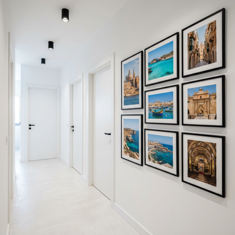
Aged Gold and Antique Brass Frames
For corridors with period character — exposed stone, traditional Maltese limestone features, ornate woodwork — an aged gold or antique brass frame is the natural choice. It nods to the architectural heritage of the building without feeling theatrical. The warm metallic tone enriches the colours within the photograph and creates a sense of collected, curatorial depth.
The Valletta Malta Grand Harbour Hotel Steps and the Valletta Malta Ornate Stone Balcony are both ideally suited to antique gold framing, the warmth of the frame echoing the golden limestone of the architecture within.
White and Off-White Frames
A white frame creates airiness and freshness. In a corridor with limited natural light, white frames can help the space feel brighter and more open. They work especially well with coastal photography, where the brightness of sea and sky calls for a frame that does not weigh the composition down. Consider a slightly wider white frame for a more substantial, gallery-quality feel.
Brushed Silver and Chrome
For thoroughly contemporary corridors with industrial or minimalist leanings — polished concrete floors, exposed brick, sleek furniture — a brushed silver or chrome frame adds edge and precision. This works particularly well with architectural black-and-white studies, where the metallic frame reinforces the graphic, structural quality of the image.
Choosing the Right Photographic Tone for Your Décor
The colour temperature, mood, and subject matter of a photograph should be in conversation with the space it inhabits. Here is a guide to matching photographic tone to décor style in a corridor context:
Black and White Photography: Timeless and Versatile
Black-and-white photography is the chameleon of wall art. It integrates into almost any colour palette, from stark modern whites to warm traditional stone, because it introduces no competing colour of its own. In a corridor, monochrome photography creates a sense of gravitas and permanence — the feeling that what you are looking at has endured, and will endure.
il-bordura’s collection includes an outstanding range of black-and-white architectural studies ideal for corridors. The bold geometric composition of the Mgarr Malta Church Blocks would arrest the eye at the end of a long corridor. The contemplative Rabat Malta Augustinian Friars Facade brings centuries of Maltese heritage to a modern wall, while the delicate play of light and shadow in the Malta Mtahleb Church Archway creates a sense of depth that draws you toward it.
Blue Hour and Twilight Tones: Atmospheric and Modern
Blue hour photography — captured in the brief window between sunset and full darkness — has a quality that is entirely its own. The world becomes still, colours shift toward deep indigo and steel blue, and artificial light begins to glow with a warmth that contrasts beautifully against the cool ambient light. In a corridor, blue hour photography creates an almost cinematic sense of transition — which is entirely appropriate for a transitional space.
The new Gozo Blue Hour collection from il-bordura is exceptional for corridor use. The Gozo Dwejra Tower Blue Hour offers a majestic, vertical composition that commands a narrow corridor wall. The Gozo Dwejra Fungus Rock Blue Hour creates a dramatic sense of coastal drama, while the Gozo Qbajjar Qolla l-Bajda Blue Hour brings a more serene, layered quality — perfect for a corridor that should feel like a moment of calm.
Warm-Toned Heritage Photography: Story and Character
Warm-toned colour photography — golden light on limestone, the amber glow of a street lamp on wet cobblestones, the rich ochre of a weathered wooden door — brings story and character to a corridor. This tone works beautifully in homes with warm décor: terracotta tiles, natural linen, aged timber, or traditional Maltese stone. It creates a sense of place and heritage, a reminder that the world beyond the apartment door is rich with beauty.
The Valletta Malta Hidden Alley Reflection (il-bordura.com/product/valletta-malta-hidden-alley-reflection-wall-art) and Valletta Malta Bridge Bar Jazz (il-bordura.com/product/valletta-malta-bridge-bar-jazz-wall-art) both carry this warm, nostalgic quality that brings life and personality to a corridor. The reflections and layered detail in these images reward closer looking — ideal for a corridor where a guest might pause.
Minimalist and Graphic: Clean Lines for Contemporary Spaces
For corridors in contemporary apartments with clean finishes and neutral palettes, a graphic or minimalist image — strong geometry, high contrast, decisive composition — can have enormous visual impact. The Malta Mtahleb Church Dome and Bell Tower (il-bordura.com/product/malta-mtahleb-church-dome-bell-tower-malta-wall-art) is a masterclass in architectural graphic composition, its strong upward lines giving a narrow corridor the feeling of vertical lift.
Lighting Your Corridor Art
Even the most perfectly chosen, sized, and framed artwork will underperform if the lighting is wrong. Corridors typically suffer from poor natural light and reliance on overhead fixtures that cast unflattering flat illumination. Consider these options:
- Picture lights mounted directly on the frame create a warm, museum-quality glow that transforms even the most modest corridor into something special.
- LED spotlights on a ceiling track offer flexibility — they can be angled precisely to illuminate artwork without casting shadows.
- Wall-mounted uplighters positioned beneath a large canvas create a dramatic, gallery-quality effect particularly suited to blue-hour and atmospheric photography.
- Warm white bulbs (2700K–3000K) complement warm-toned and colour photography. Cool white (4000K) enhances the graphic quality of black-and-white architectural studies.
Creating a Gallery Corridor: Curating Multiple Works
If your corridor is long enough to accommodate multiple works, consider curating a thematic gallery rather than placing pieces randomly. A gallery corridor tells a story, and the most compelling stories have a thread running through them.
Some approaches that work particularly well:
- A single location, multiple perspectives. Choose four to six photographs of the same Maltese town or landmark — different seasons, different times of day, different compositional approaches. Hung in sequence, they create a rich, multi-layered portrait of a place. il-bordura’s collections of Valletta, Gozo, and Rabat offer exactly this depth.
- A tonal journey. Select works that share a colour palette — all blue-hour photographs, or all warm-toned heritage images — but vary in subject. The visual coherence of the palette unifies the corridor while the variety of subjects creates interest.
- Black and white with one colour accent. Hang three or four black-and-white works interspersed with a single strong colour photograph. The colour piece becomes a punctuation mark, a moment of surprise that draws the eye.
- A timeline of the islands. Take your visitor on a journey through Maltese history and landscape — from the ancient stone of rural Rabat to the baroque grandeur of Valletta to the wild coastal beauty of Gozo. This approach works especially beautifully in homes where Malta is not just a backdrop but a deeply held identity.
The Corridor as Narrative
The corridor is not merely a place to pass through. It is the first chapter of your home’s story, the moment before the main room, the threshold between the world and your private world. When you choose art for this space with the same care and intention that you bring to a living room or bedroom, something remarkable happens: the entire apartment gains coherence, depth, and character.
At il-bordura, every photograph in our collection has been chosen because it does more than decorate — it tells a story about the Maltese islands, about light and time and stone and sea. Whether you are drawn to the atmospheric drama of the Gozo Blue Hour series, the architectural precision of our Valletta studies, or the contemplative power of our black-and-white heritage collection, there is a piece in our collection that will make your corridor unforgettable.
Browse the full il-bordura collection at il-bordura.com and discover the art that belongs on your walls.